
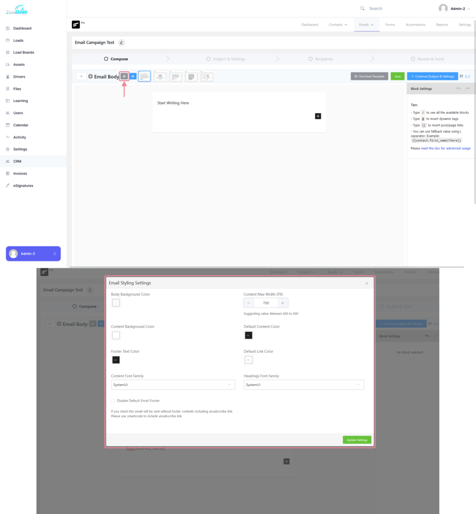
Email Styling Settings #
Clicking on the “Gear” icon, allows you to edit some of the email styling settings which include the following:
- Body Background Color
- Content Background Color
- Footer Text Color
- Content Max Width (PX)
- Default Content Color
- Default Link Color
- Content Font Family
- Heading Font Family
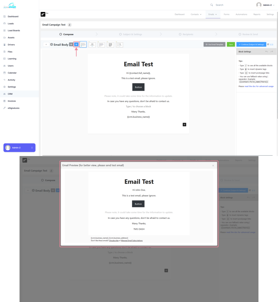
Previewing the Email #
To preview the email, you can click on the “Eye” icon next to the “Gear” icon, this will display the preview.
Email Templates #
Template Types #
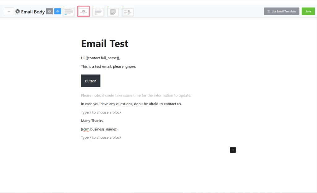
Simple Boxed #
This is the default template, where the content is is centered and in a container.
Plain Centered #
This template is very similar to the default template.
Plain Left #
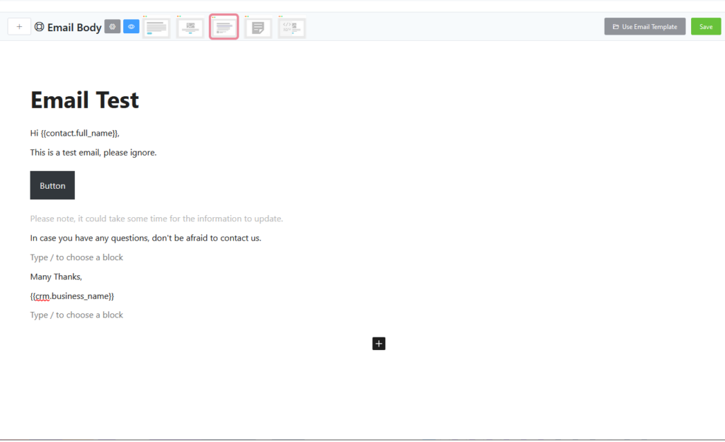
The entire email’s content is aligned to the left using this template.
Classic Editor #
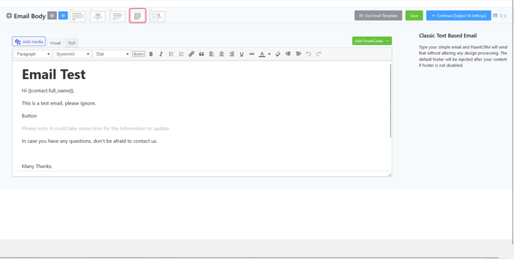
This option is for you if you are accustomed to using the older WordPress Classic Editor. Compared to the Gutenberg Editor, you have more control over the content.
Raw HTML #
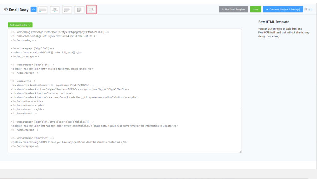
The most advanced and also useful in terms of technical uses, such as importing templates from other sources.
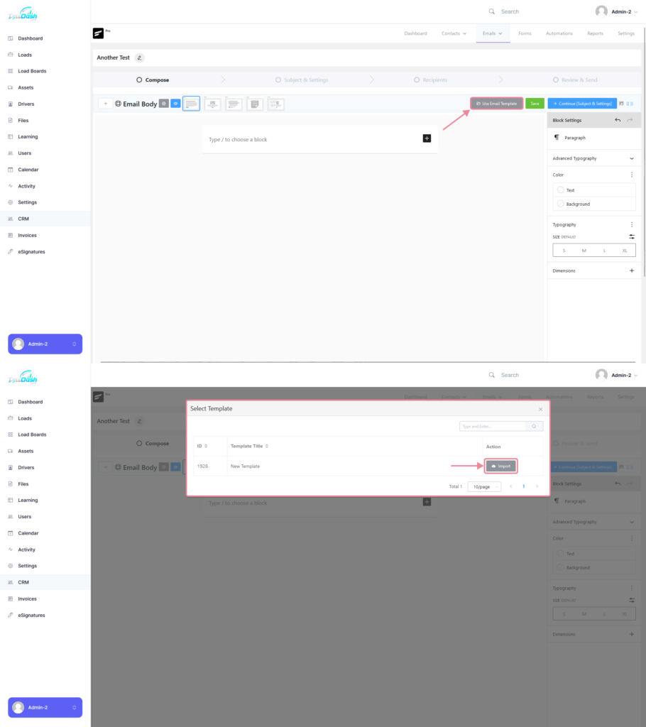
Custom Email Templates #
You can use any custom email templates that you have created, for more information on creating email templates click here.
To use the custom email template, clickon the “Use Email Template Button”, this will display a popup with a list of all the created templates. After you have chosen a template which you wish to use, you can then just click on the “Import” button.
Advanced Features #
Quick Content Blocks #
By using the “/” symbol you can access the available block types used in the email content.

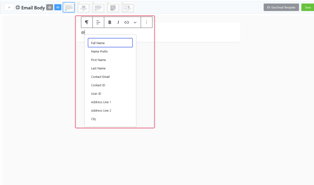
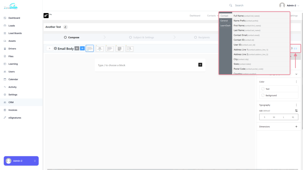
Shortcodes #
You can add Customer or Contact Data that is available in the CRM into your email by either typing the “@” symbol and selecting the data you want to input,
or you can click on the “{{}}” button on the right hand side of the page which will display all the available data.
Clicking on one of the items in the list will copy the shortcode to your clipboard which you can then paste into your email
Content Blocks #
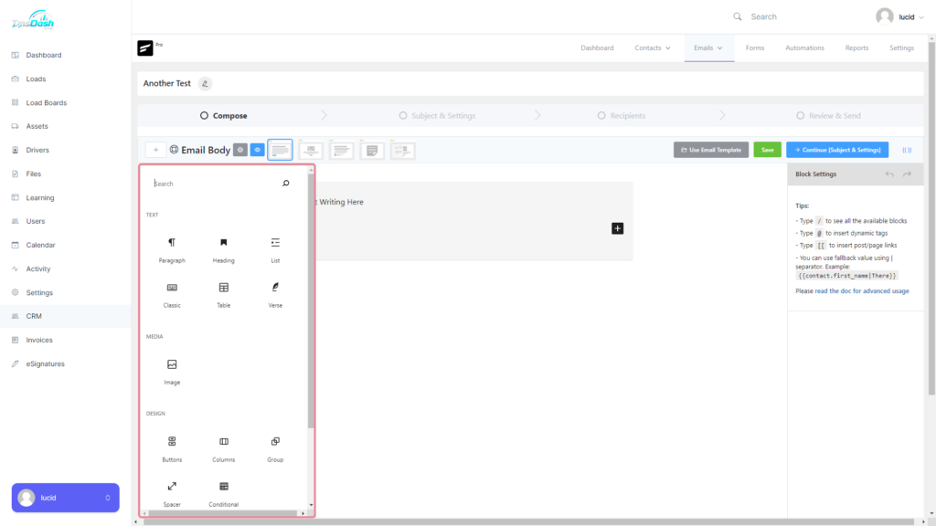
Text Content Blocks #
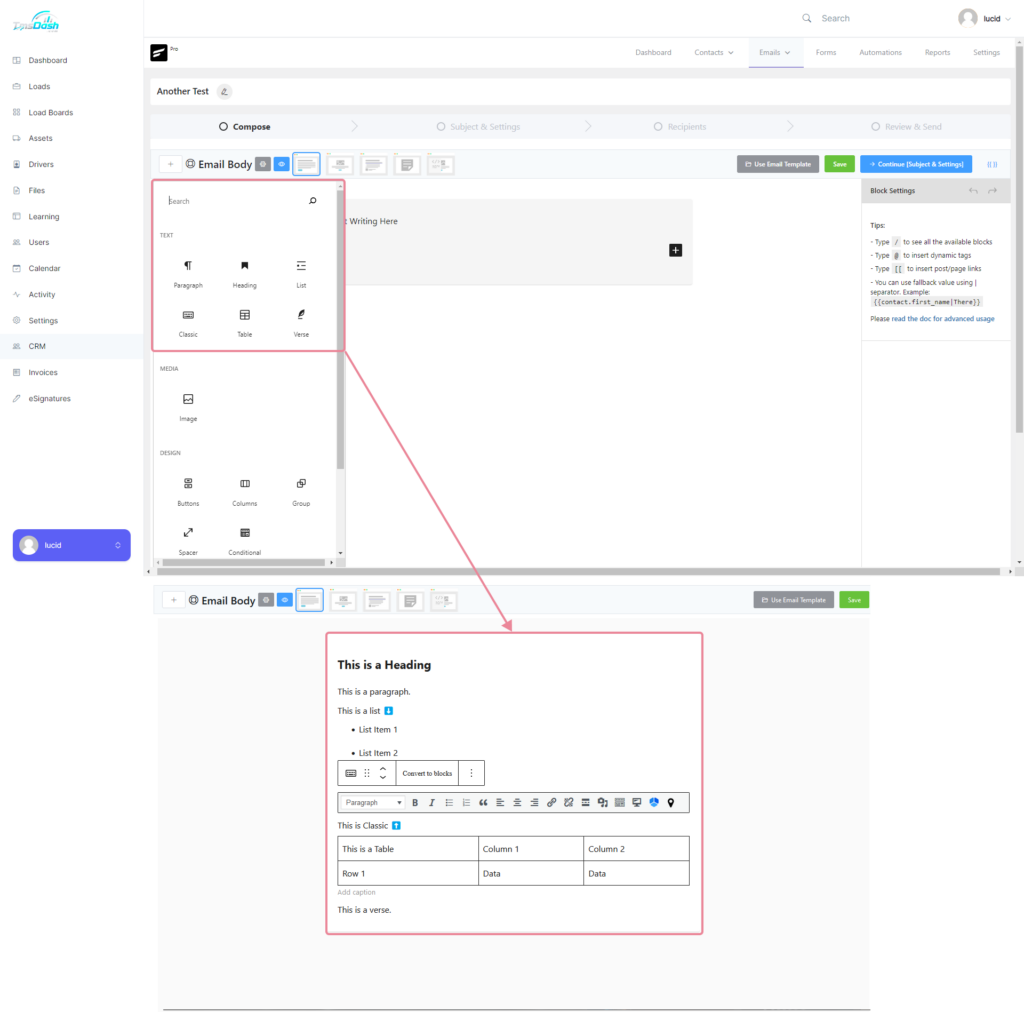
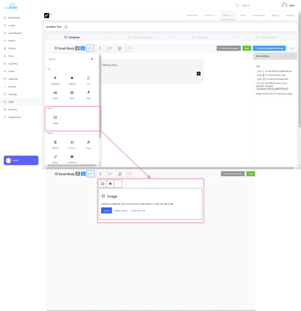
Image Content Blocks #
Design Content Blocks #
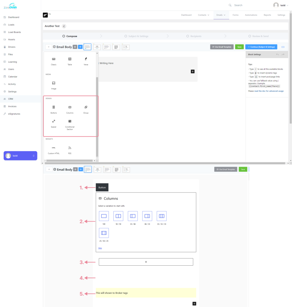
1. Button #
You can add a button as a Call to Action component.
2. Columns #
You can choose the layout for the columns you wish to make and inside each column you can add different content blocks.
3. Group #
This allows you to group multiple content blocks.
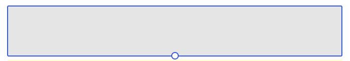
4. Spacer #
A spacer allows you to create more space between blocks. When creating a spacer it will appear gray, as soon as you are done creating your space it will go transparent.
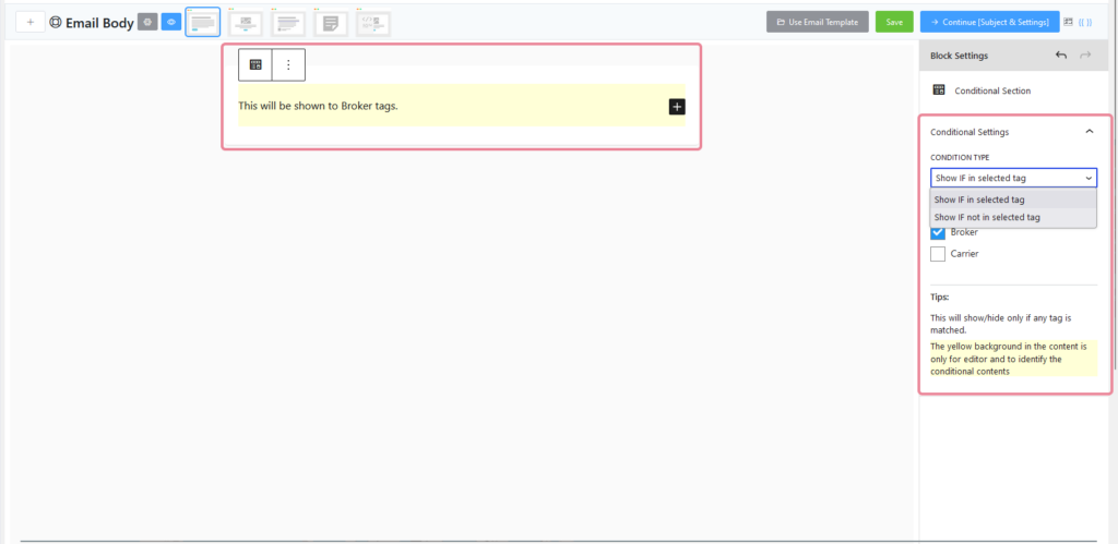
5. Conditional Section #
The Conditional Section block allows you to add certain conditions such as if a member has or does not have a certain tag.
Only members who meet these conditions can see the content within this block.
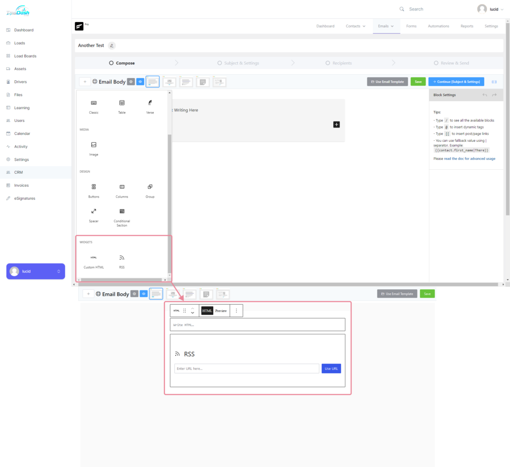
Widget Content Blocks #


Responses